Visualising the dreadlocks(without reminding Bob Marley).
Dreadlocks Music Label | Brand Identity
/Challenge
Dreadlocks is a Hong Kong EDM music label. Unlike the mainstream labels that targeting the mass, dreadlocks' target audiences are the organizer of music festival and curators and club owners.
They don’t want a cliché logo showing the dreadlocks silhouette. They want a logo that is meaningful.
/Strategy
Dreadlocks have been worn in a diversity of cultures: Maasai warriors are known for their long, thin, red dreadlocks; Tibetan Buddhism monks use locks as a substitute for a shaved head; Aztec priests let their hair grow naturally untouched, allowing them to curl around itself.
Dreadlocks is niche yet diversify. Just like EDM music.
/Creative
How to make the dreadlocks logo more diversified?
There are only 26 English character, yet there are more than 1,000,000 English words. (Robert McCrum, William Cran, & Robert MacNeil. The Story of English. New York: Penguin, 1992: 1) If we create a dreadlocks typeface, it will have 1,000,000 combination possibility.
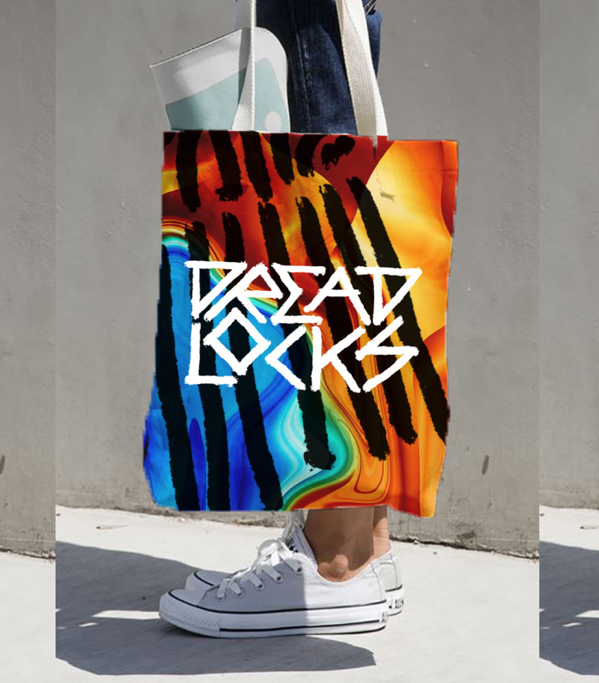
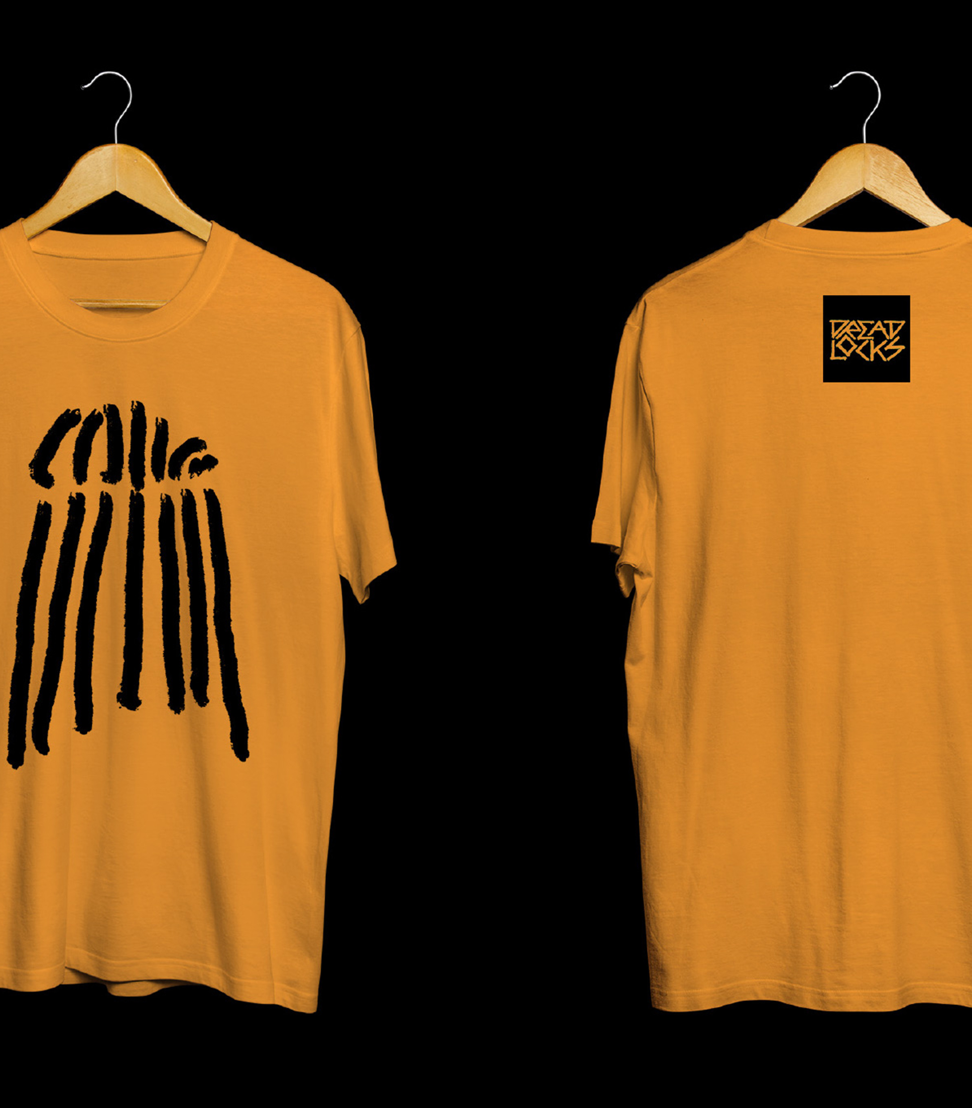
So we have an idea -- to create a customized dreadlocks typeface to represent its diversity. Because the texture of dreadlocks is the most stand out visual element, we made a brush stroke out of the dreadlocks texture and handwrite from A-Z to create a bold, yet warm typeface. Then we use the typeface to make the logo, and matching with the bright, blurred background to capture the energetic vibe of EDM music.

Primary logo.
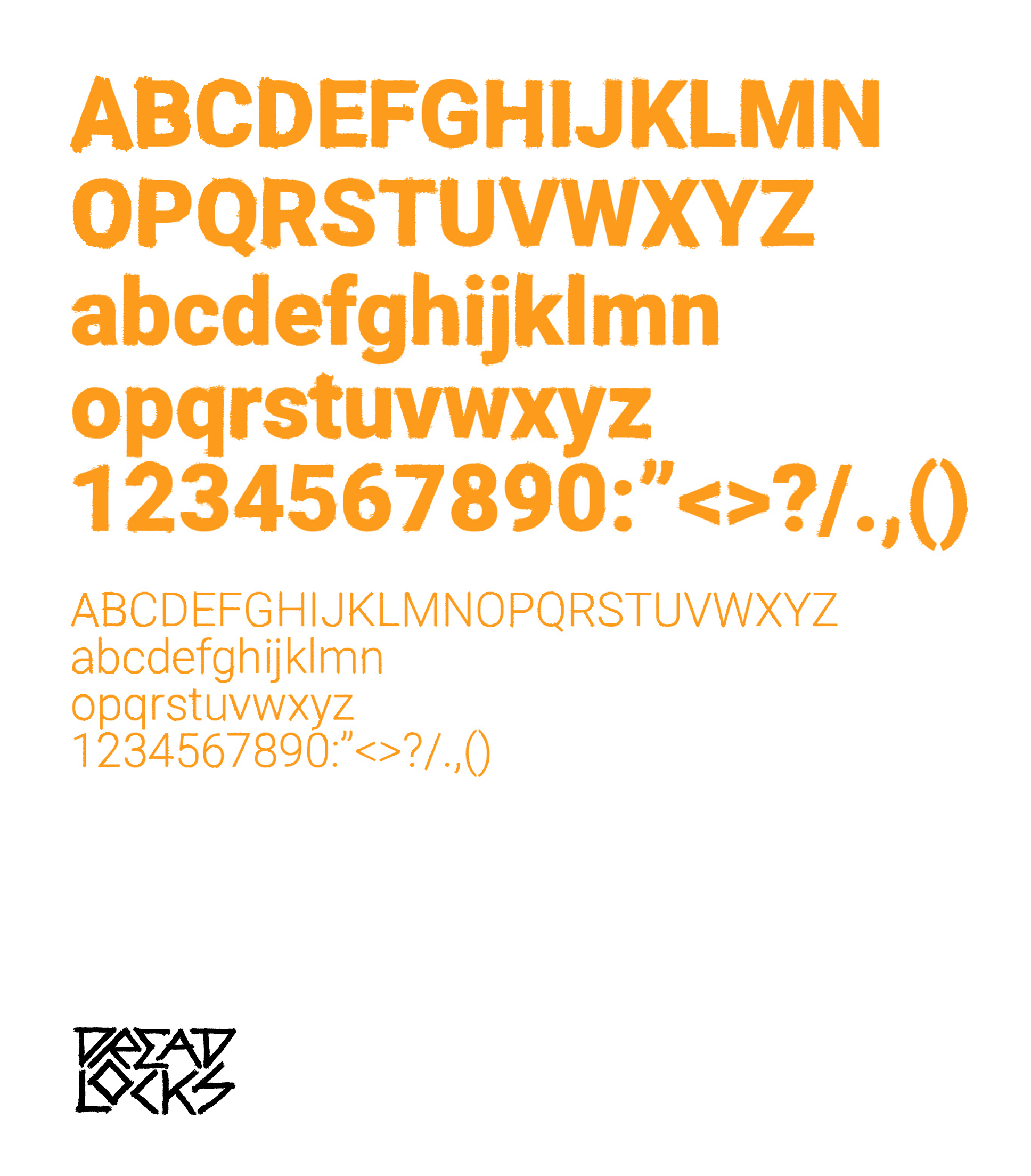
Brand typography.
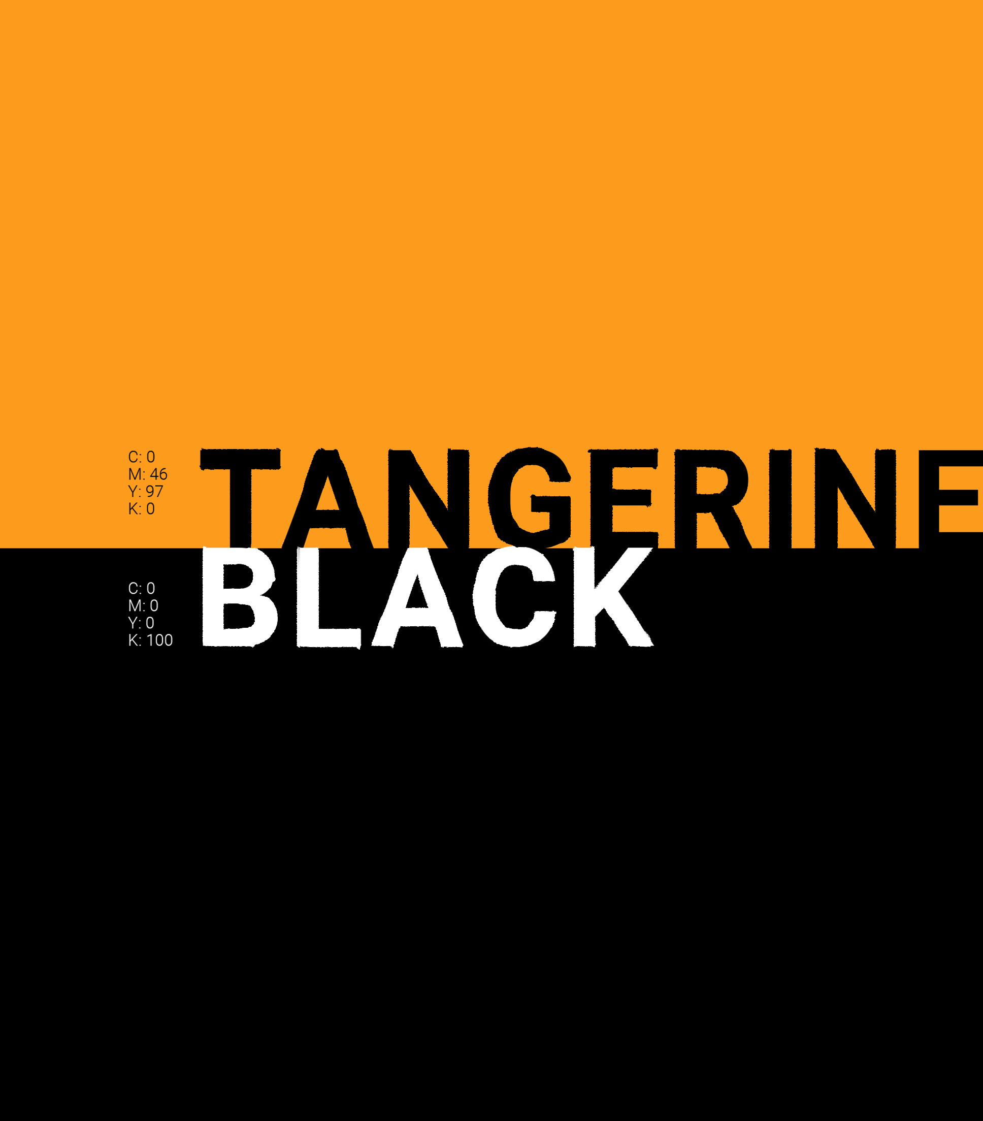
Brand colors.